Brand Refresh and Renaming
The Rock 'n' Roll Marathon Series, a globally renowned running series, undertook a comprehensive brand refresh and renaming, transforming into the Rock 'n' Roll Running Series. This rebranding initiative aimed to revitalize the brand’s identity, enhance participant experience, and boost merchandise sales.
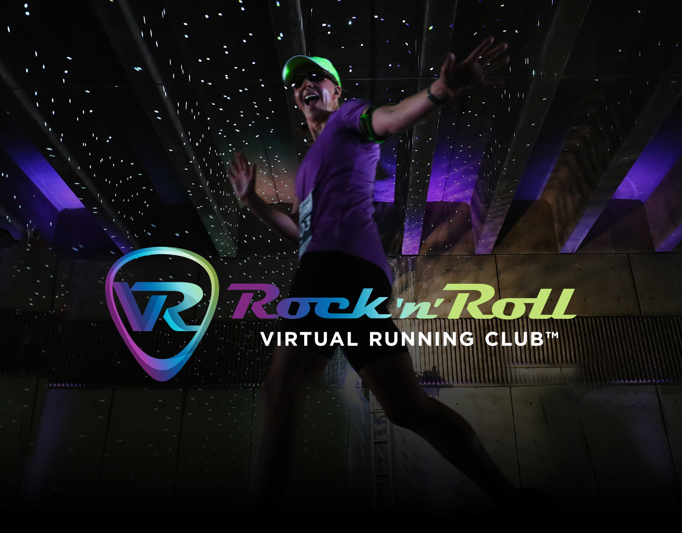
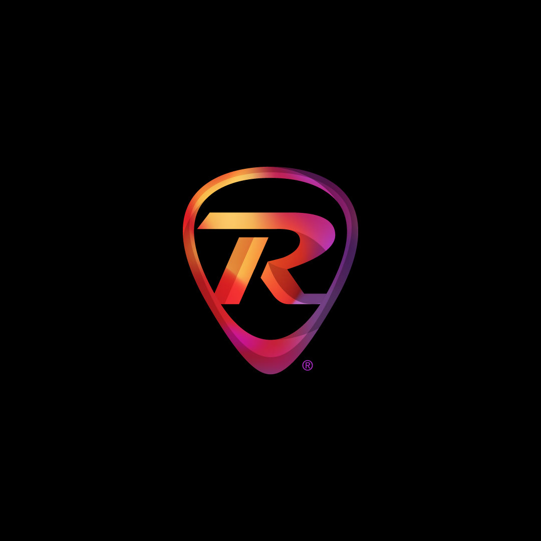
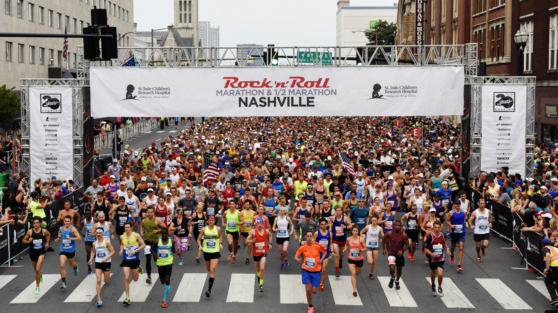
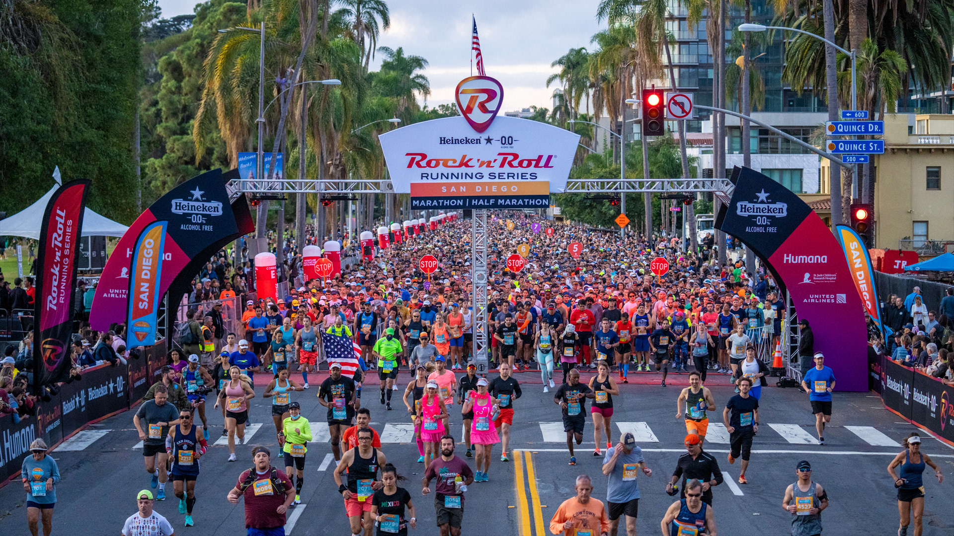
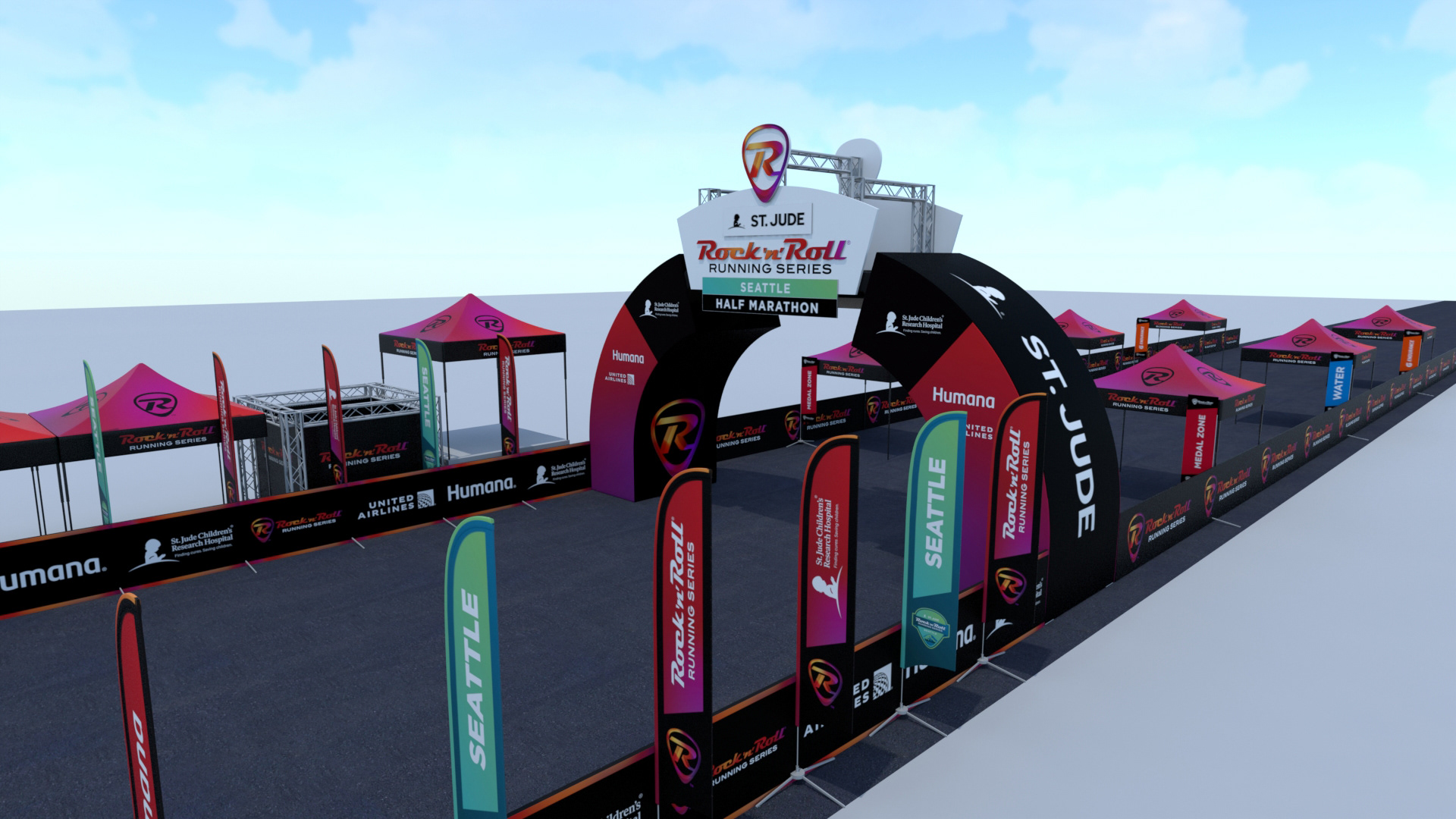
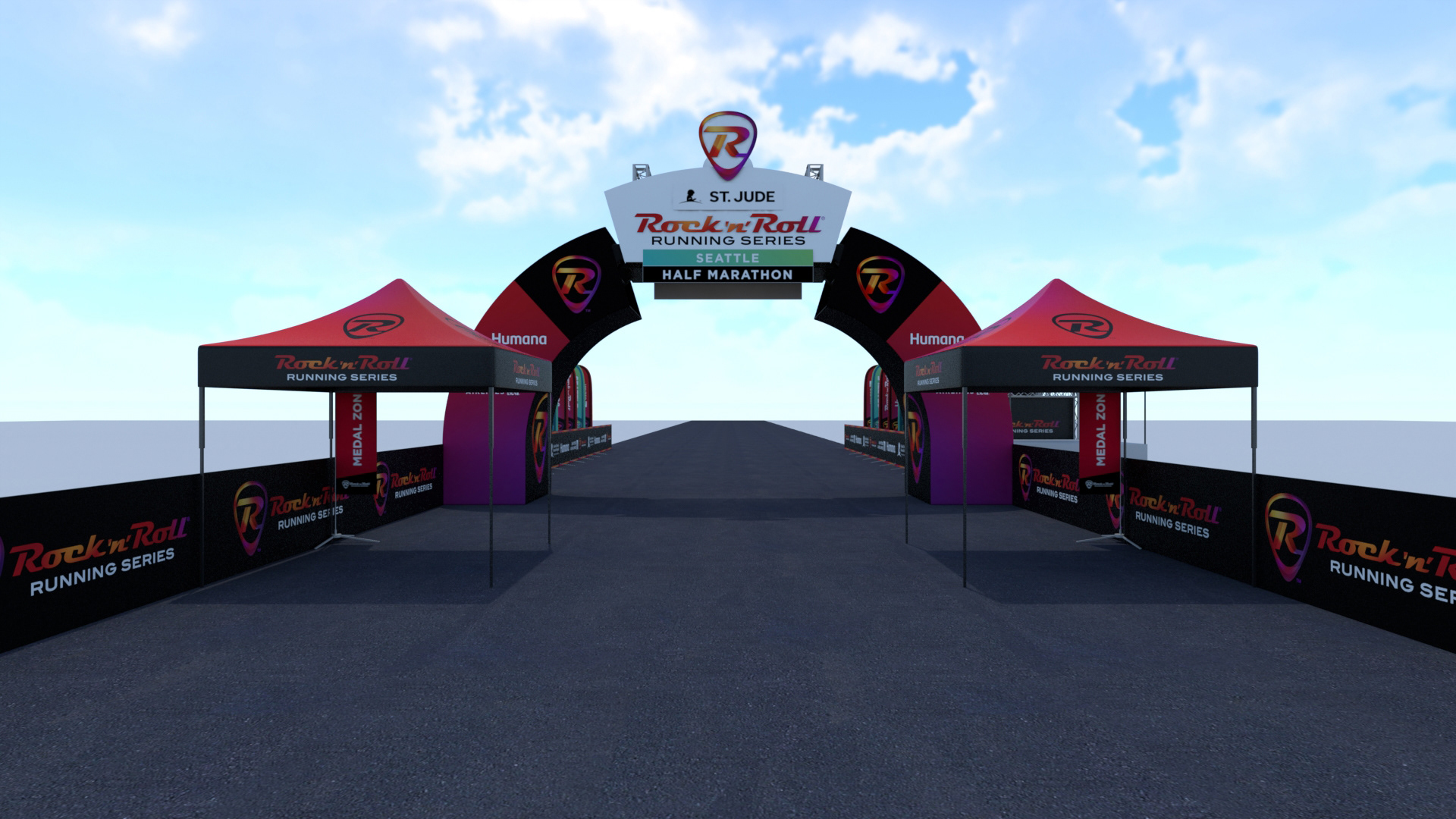
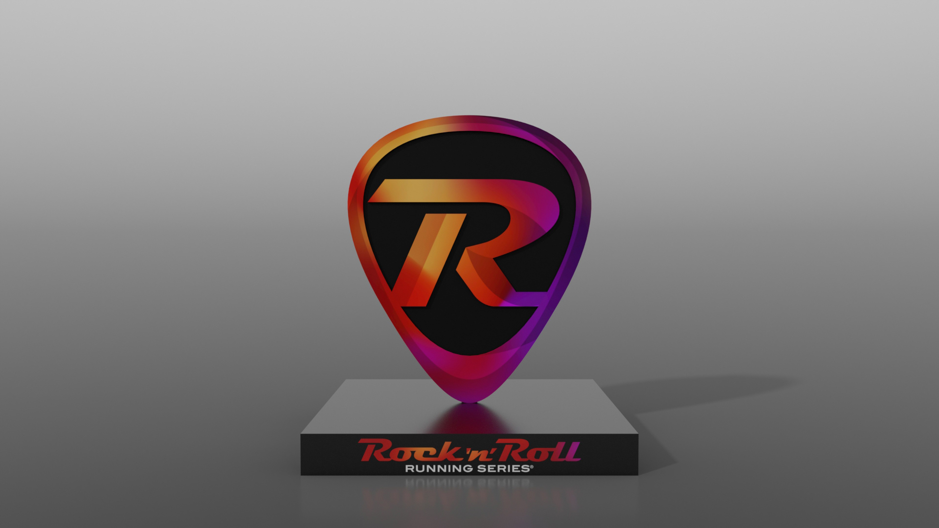
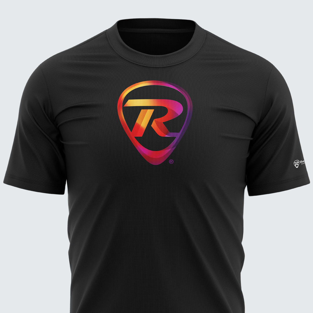
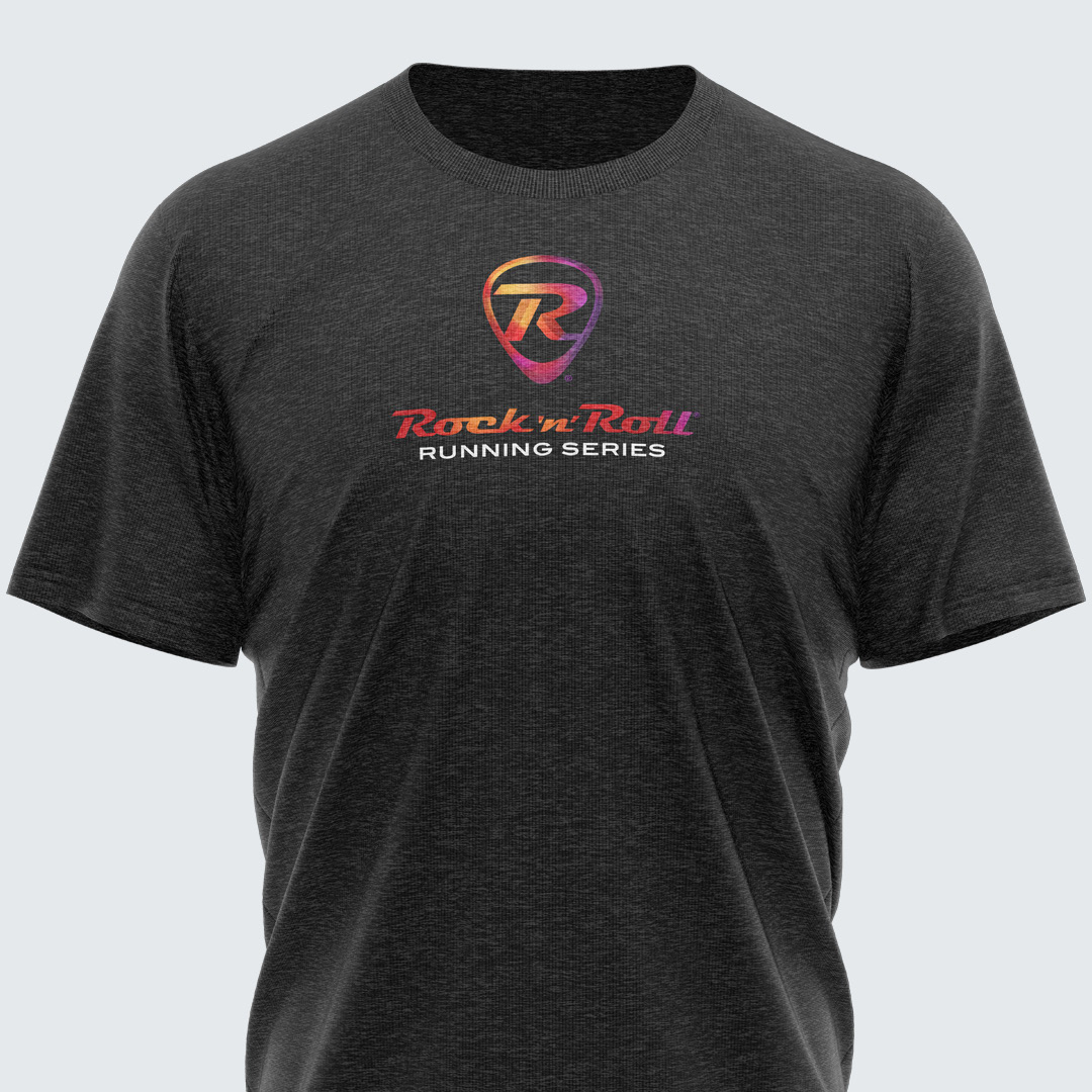
The new brand identity needed to resonate with both the existing loyal participants and new runners. The redesigned logo maintained the essence of the original but with a modern twist, symbolizing energy through a burst of vibrant colors, all encapsulated within the shape of a guitar pick. This update extended to all run course elements, ensuring a cohesive and invigorating visual experience throughout the event.


Event Logos and Health and Fitness Expo
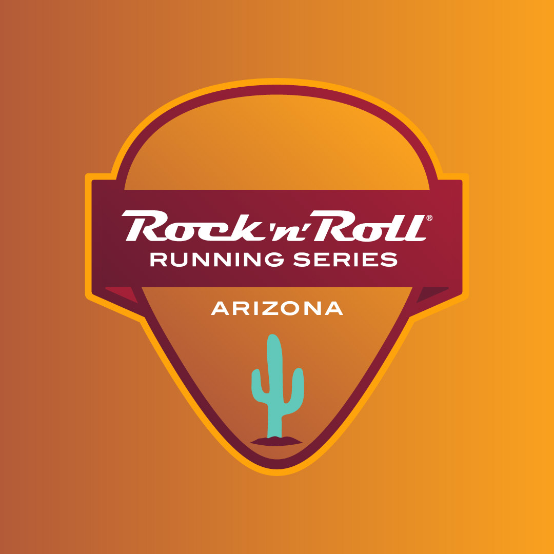
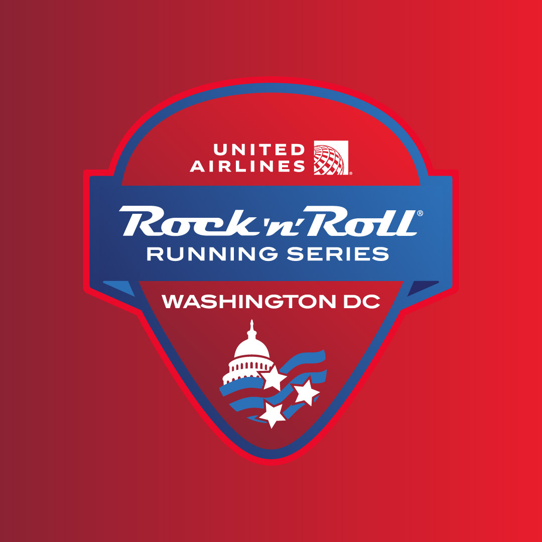
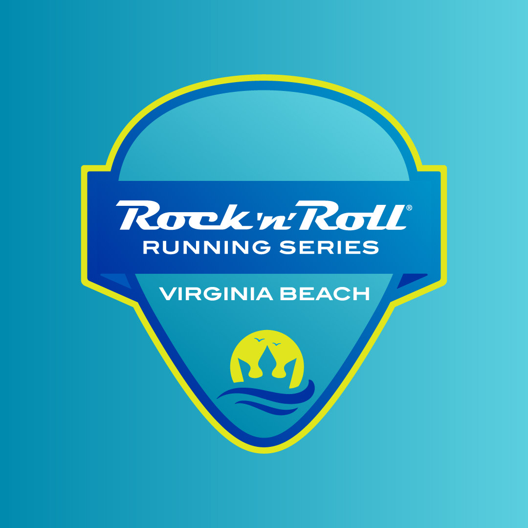
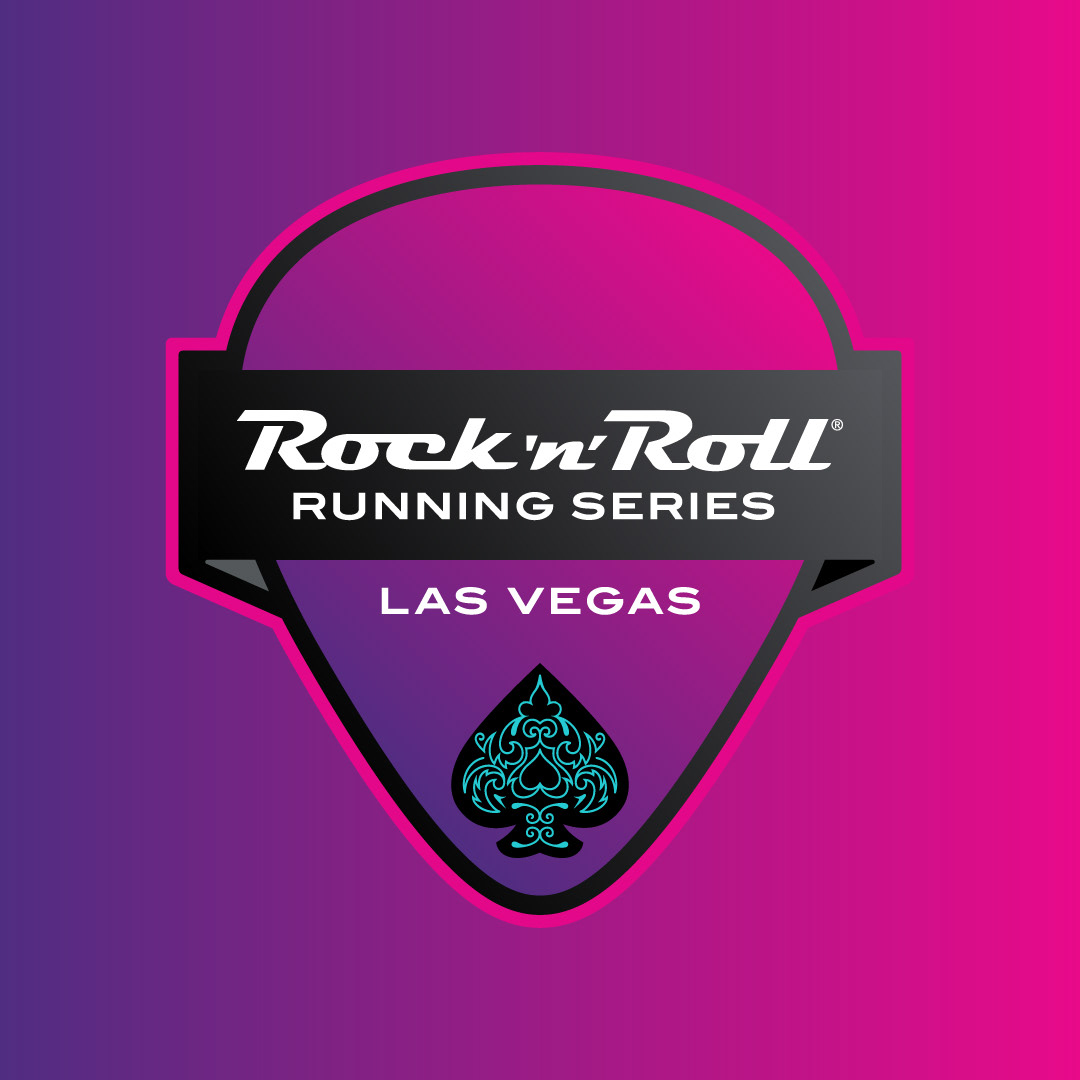
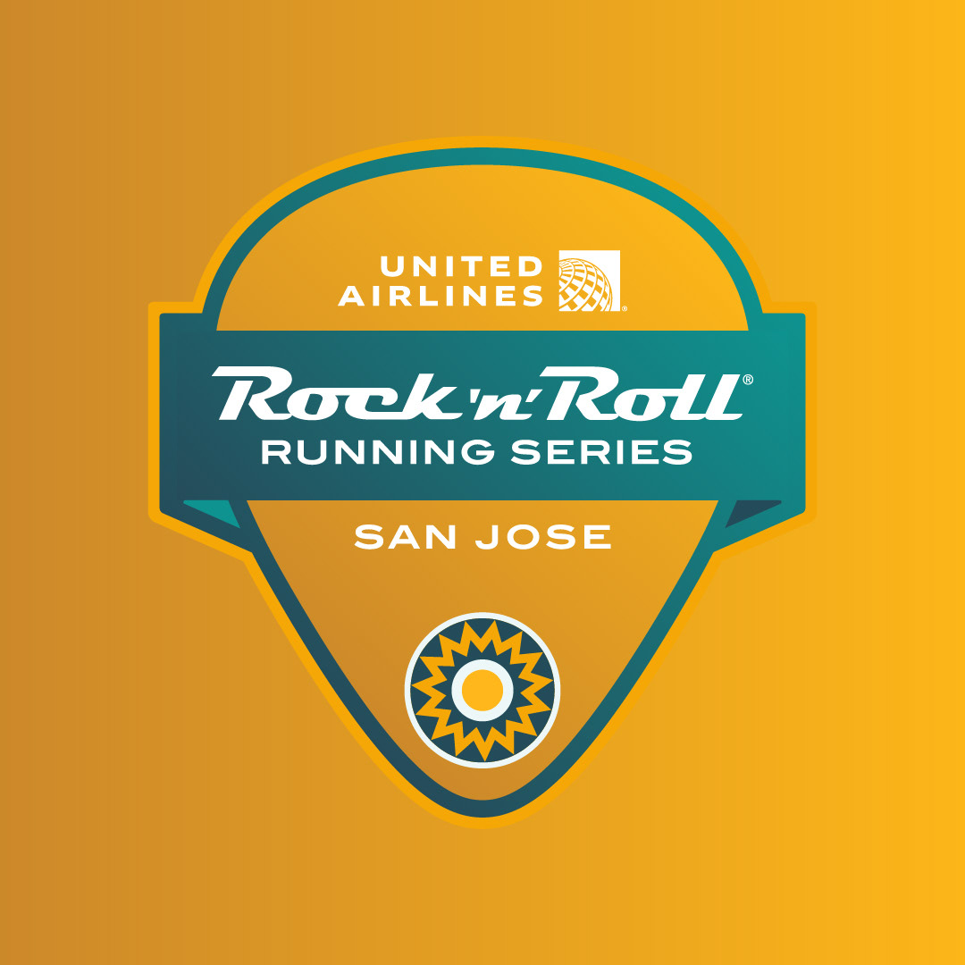
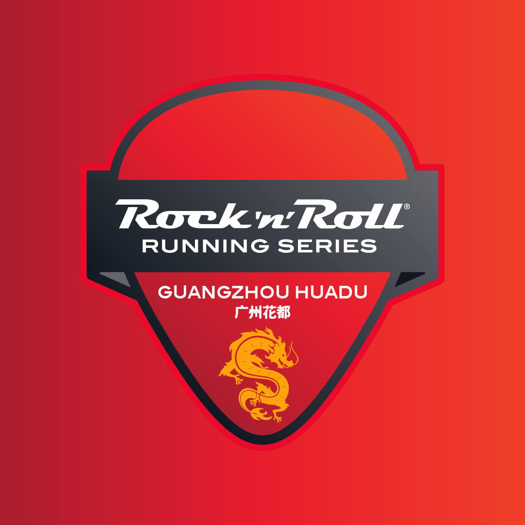
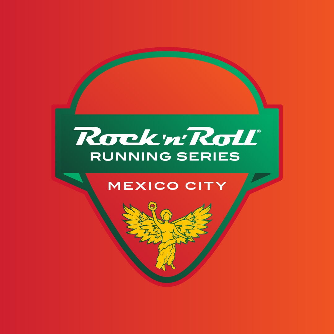
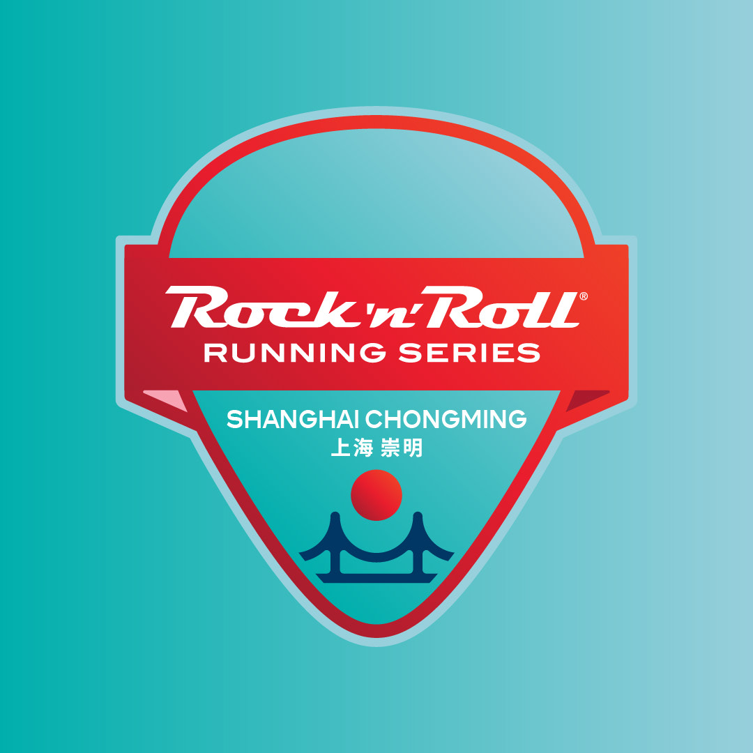
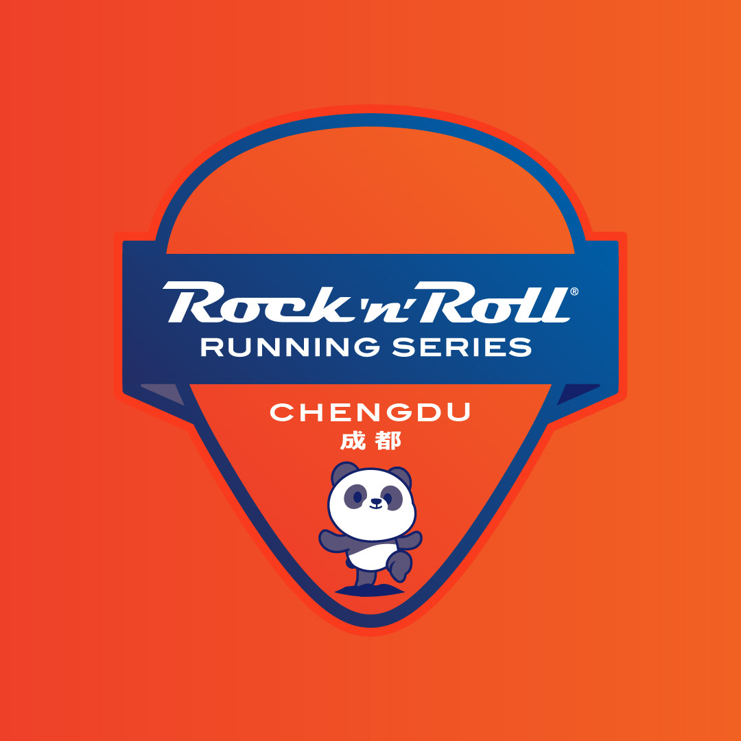
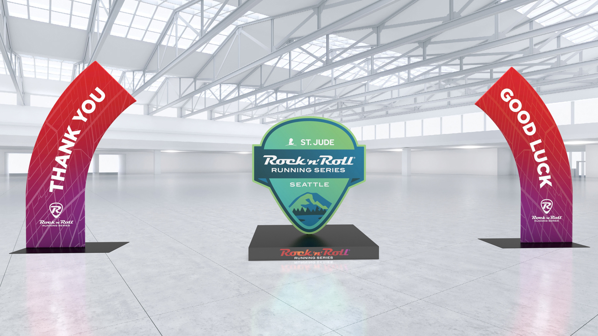
Each of the 20 events in the series was given a unique logo, reflecting the distinctive character and cultural elements of the location. These logos played a significant role in driving merchandise sales, as participants sought to commemorate their unique experiences.
The Health and Fitness Expo, a crucial part of the event experience, received a complete overhaul. The new design aimed to provide an engaging and informative environment, highlighting fitness trends and health products, thereby enriching the participant experience.
Merchandise
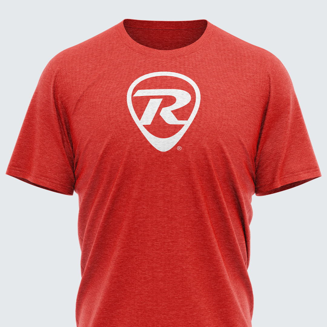
The rebranding led to a significant increase in merchandise sales, attributed to the refreshed and appealing designs. The new brand identity not only reinvigorated the participant experience but also attracted a broader audience, enhancing the series' reputation and reach.
25 Years Running
For the 25th anniversary, a special logo and identity were created to celebrate this milestone. This design honored the legacy of the series while looking forward to its future, integrating elements of the new brand identity with a commemorative flair.
Conclusion
The comprehensive rebranding of the Rock 'n' Roll Running Series successfully modernized the brand, improved participant experience, and boosted merchandise sales. This project showcases the power of thoughtful design and cohesive branding in reinvigorating a well-established event series.


